So, to a certain extent, we do judge a book by its cover. That being the case, what does it tell us that, very often, the US and UK publications of a title have different cover art? George Bernard Shaw once said that England and America are "two countries divided by a common language." In a similar vein, Oscar Wilde wrote that "[w]e [in England] have everything in common with America nowadays except, of course, language." Art is its own language, and it appears we are divided there, too.
Let's look at some recent titles and their cover art and see what it tells us about their different audiences––or what the publishers think will appeal to the different audiences.
 |
| UK edition |
 |
| US edition |
The UK cover of Nick Harkaway's Angelmaker alludes more explicitly to important features in the book, like the various mechanical items, especially the clockwork bees––though the box in the center of the US cover does look like the key automaton in the book. I'm not sure what those orbiting doohickeys on US cover are supposed to be. Extremely stylized bees?
 |
| US hardcover |
 |
| UK hardcover |
Della just recommended Miguel Syjuco's Ilustrado to us and wrote a terrific review here. Her thumbnail description of the book was that "[i]t starts with the discovery of a dead body in the Hudson River and turns into a story about two Filipino families over 150 years in a kaleidoscope of excerpts from many sources, including interviews, a noir story, blog posts and an omniscient narrator." Much of the book is in the form of many different sources, like interviews, memoirs and novels.
It's appropriate for a book Della described as kaleidoscopic to have so many different covers. The UK hardcover jacket artwork isn't just beautiful; it alludes to the written word that the novel relies on. Notice how the US paperback then picks up on the UK hardcover theme, abandoning the look of the US hardcover––which seems just as well to me, since the US hardcover doesn't convey anything.
 |
| US paperback |
 |
| UK paperback |
I'm guessing the publishers decided to pitch to a different audience with the UK paperback. Turning away from the literature theme, the paperback cover refers to the New York City and Philippines locations and reproduces a blurb that calls the book an adventure.
| US edition |
 |
| UK edition |
The US and UK covers of Ruth Rendell's The St. Zita Society are a study in contrasts. Dark and light, symbolic and representational. Rendell is so well-known in the UK that she needs no cover blurb, while in the US somebody (oddly, it seems to me) thought it would be a good selling point to have a Stephen King blurb. I'm interested to see that the US publishers decided to abbreviate "Saint." How long a meeting do you suppose it took to decide to make that change? Longer than it took for the US publishers to decide to name the third Stieg Larsson book The Girl Who Kicked the Hornet's Nest instead of the UK's The Girl Who Kicked the Hornets' Nest?
 |
| UK edition |
 |
| US edition |
We see another dark/light contrast with the covers of S. J. Watson's Before I Go to Sleep. I was interested to see that the UK publisher chose to use an American writer's cover blurb. Is Tess Gerritsen particularly popular in the UK? Dennis Lehane is a bigger name in the US than Gerritsen, so I'm not surprised to see the US publisher choose a Lehane blurb for the US cover.
 |
| US edition |
 |
| UK edition |
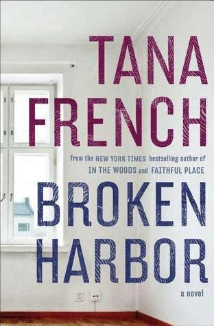
The US edition of Tana French's Broken Harbor is fairly consistent with the look of the prior books in the series, while the UK cover is more photographic than the early books. I wouldn't have expected that the UK publishers would chose to use a series of quotations from reviews, rather than take the US approach of referring to French's prior successful titles in the series.
I don't know about you, but I'm a little surprised by these covers. It seems to me that the UK covers here are frequently more detailed, specific and representational rather than symbolic––and they're certainly lighter. The US covers use negative space more in these covers. Conventional wisdom is that the British are more sophisticated and subtle than Americans, right? I don't see that in this sample. But let's forget all the analysis and get to cases. Which one in each pair do you find more appealing? Here's where I come out:
Angelmaker: UK
Ilustrado (hardcover): UK
Ilustrado (paperback): US (but note it's a takeoff on the UK hardcover)
The St. Zita Society: UK
Before I Go to Sleep: US
Broken Harbor: US
How about you?
Sadly, the UK publisher did not choose to go in a different direction for the book jacket of Jess Walter's Beautiful Ruins. Our British friends must also be subjected to the same garish 1950s postcard that we have to look at.
